“Responsive Web Design.” Have you ever heard of this term? Well guess what. You’re in luck. I’m here to tell you the basics and where you can go to get started. Remember back in the 90’s when we wanted to get on the internet, we would have to jump on our Compaq or Dell computer and launch AOL (and for those who are too young to remember what that is, it’s America Online.) We would type in our screen name and password and then suffer through the piercing sounds of the modem connecting to a server and finally… Viola! We were online! We could launch a web browser and surf the WWW or World Wide Web!
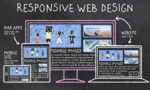
Today we’re not limited by such primitive tech as AOL or even a computer. We have tablets, smart phones, phablets, glasses, and watches. This also means that now we have all of these different screen sizes that need to be taken into account when building a website.
So what?
Well, I know you’ve had this experience: You are sitting at your local coffee shop and BOOM. It occurs to you that your wife gets home tomorrow and you still haven’t fixed the gaping hole in the wall from your little DYI project you decided to do while she was gone. You pull out your <insert your favorite device name here> and search for a contractor or miracle worker on <insert your favorite search engine here>. You find a link to a local small business that performs miracles but when you click on the link, the site is hard to read because it’s not formatted for your device. You simply push the back button and click on the next link. This site is much easier to read on your device and you click the “Emergency” button on their home page and are on your way.
Simply put, responsive design is a way to design your website to work on any screen on any device. Simple right? Who cares if my site looks lame and is hard to navigate on some sort of hand-held device?” The answer is You! You should care because not only can your site not function properly if it’s not formatted for different devices but it can also give customers the impression that: A) I don’t care about my website or my business to make it accessible on all devices or B) I’m too cheap to invest in a modern website and this is a reflection of my products or services.
Responsive Design is very easy to implement and is worth the added effort. Bootstrap is a responsive CSS framework built by some guys over at Twitter to help solve the problem of designing a site for multiple screens and devices. Check out their site. It’s very easy to implement Bootstrap and it will make your website look professional no matter what device is viewing it. Now sure there are others out there, but I’m just giving you a place to start… not doing all of your homework for you!